


Transitioning a casual clothing retailer from offline to online.
Starting in 1994, Mirror has been a successful clothing store targeting an audience looking for good quality at an affordable price range. They have 400 stores around the world in 32 countries. After years of customers asking about an online storefront, the people at Mirror have decided to create a website to sell their products on. (This is a fictional company created by DesignLab as a project prompt).
My Goals:
Design a responsive ecommerce website that is easy to use and that allows customers to browse through all products and filter by size, color, style and others.
Design a logo for the company that is modern and neutral enough to attract all types of people and styles.
Project Duration:
80 hours over 4 weeks.
To learn about the experience of Mirror’s customers when shopping both online and offline.
To understand Mirror’s competitors and what makes their online businesses successful.
For competitors, I looked into Old Navy, H&M, Stitch Fix, Amazon, and Target, seeing what strengths and weaknesses each company had.
On top of this, I conducted research on the casual clothing market, both online and offline, which allowed me to gain some more insight on what the market is like through quantitative data.
Through conducting 1 on 1 interviews with participants that fit the Mirror’s target audience demographics, I was able to observe needs, wants, desires, and pain points from the participants.
Taking the notes gathered from the interviews, I put together an Empathy Map, allowing me to categorize and analyze the information into similar groupings.
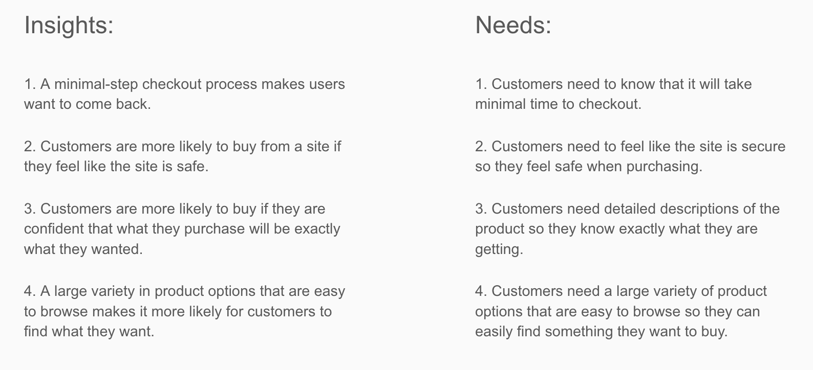
Through the Empathy Map, I was able to uncover insights within the comments, and then synthesize the user’s needs.
After gathering Insights and Needs, and using the competitor analysis, I created a Persona to represent what a potential customer of Mirror would be like. This allowed me to further empathize for the users and humanize the research.
After making a Persona, I used the persona to create a Storyboard, which tells a story about the persona interacting with Mirror. This further humanized the persona, allowing me to empathize for the user even more and get closer to the user experience of the product.
With so many needs to consider for Mirror’s site, I created a feature roadmap to prioritize those needs based on my various conducted research methods. This helped me visualize what was important to focus on and what wasn’t as much.
At this stage in the process, I conducted a open-ended card sorting with participants, allowing me to see the participants group articles of clothing into categories of their own choosing.
This process helped me to understand how the user categorizes products in their own mind, helping me design categories later on.
A site map is how every page on the site connects together. It is the bones of the whole website. Getting this done for the project is a huge step, because it gave me a reference to look at when designing Mirror’s overall site.
Taking the Storyboard story of our persona, I created a Task Flow diagram depicting how he would navigate the site in the story. This helped me understand navigation on the site, shedding light onto anything that might’ve been unnecessary steps and/or unclear flow.
Putting multiple tasks flows together for my Persona, I created a User Flow diagram. At this point, I could now see which pages would be of utmost and/or least importance, depending on how often my persona needed to access a page.
I created some low-fidelity sketches of the Mirror homepage. Low-fidelity sketches are the best place to start when it comes to the visual design, allowing me to put whatever ideas I had onto paper without any drawbacks.
Taking all the information I’ve gained up to this point, I created low-fidelity wireframes for the site, as well as put together a prototype with them using Invision. Creating a prototype at this stage was very useful because it allowed me to test the site before actually putting in any time and effort into designing it.
Taking those wireframes, I created screens for both tablet and mobile. We live in a world of tablets and smartphones, so creating Responsive Wireframes has become a necessity.
Using Pinterest, I created Moodboards, finding colors, images, and typography that I felt reflected the Mirror Brand in order to help guide me with style decisions later on.
Designing a logo can take a very long time, so I brainstormed ideas with the time restraints given to me. Then, I finalized one to be the Mirror logo, making it the identification for Mirror’s experience and brand.
After all these style decisions were made, I put together a Style Tile, which shows all the style decisions made for Mirror and puts it in one document for future reference.
Now that there’s a style guide, I took the responsive wireframes and upped the fidelity level of them so future prototypes could be closer to the real deal, including UI functionality.
Next, I created a UI kit, where I put all of the design patterns and UI components I wanted to use for the site. The document was also continuously updated as design changes occurred throughout the process.
At this point, I updated the prototype on Invision to be a higher fidelity level, and added a plethora of screens to make sure the prototype has all the necessary assets to perform the task that will be given during the Usability Test.
The goal of the usability test is to gain insight on the comfortability and usability of the Mirror’s navigation and user flow. All feedback and notes will potentially be used to iterate on the prototype and then tested again.
Participants were told that they needed to buy a casual sweater for a friend’s party, which they had to do using the Mirror Prototype. They were to explain their thought processes out loud, and then follow-up questions would be asked and answered.
Taking the notes gathered from the Usability Test, I put those notes onto Post-Its and created an Affinity Map by organizing all the information into Struggles, Patterns, and Comments. The notes I took on the participant’s struggles at each stage of the process allowed me to figure out success rates at each step, as well as information on the failed cases. Then, grouping similar notes, I was able to find insights that synthesized into recommendations that could potentially improve my prototype.
This project was my first attempt at the design thinking process. It helped me cement a lot of fundamental concepts that are necessary to internalize as a UX Designer.
Some Takeaways:
1. I learned that you truly never know what you might discover when interviewing, so keeping an open mind is essential when conducting interviews.
2. I learned the importance of empathy in EVERY step of the design process, for the users and also for the team you work with.
3. I learned to trust in the design thinking process and the research phase to get us what we need to solve and design.
Next Steps:
Based on the feedback gathered from the usability testing, I would go back to the prototype and adjust accordingly. On top of this, I would up the fidelity level of the prototype even more, adding in features that I never got to and updating UI components. Once all of this is done, I would conduct another usability test to further improve the website and confirm that my updates improved my product the way I intended them to.